It’s been a while now since I did any updates on this site’s design. Back in Korea, I actually worked on a whole new design, but I never got it up because I never felt happy with it. I keep coming back to the simplicity of this fade to white.
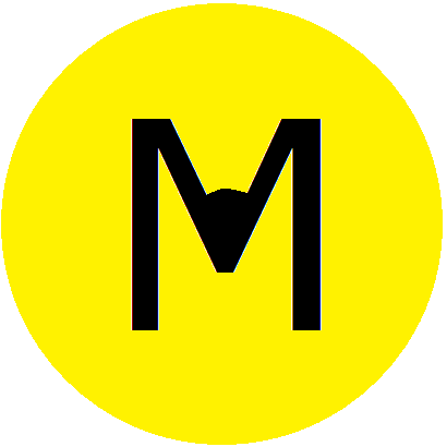
Looking through some old files, though, I rediscovered a logo I created back then and decided to go ahead and use it here. You’ve probably already noticed it up in the top left corner. Here it is expanded:
- M is for Marshall. That’s the most obvious part. It’s been my letter since, well, pretty much since I was born.
- Yellow is my favorite color, so I had to use it somewhere. I like yellow because it’s happy and full of energy and because people either love it or hate it. It’s provocative, in the truest since of the word.
- I tried a bunch of different typefaces for the M. Eventually, I came back to Verdana, the typeface I (currently) use on the rest of the site, not necessarily my favorite but one that’s easy to read and readily accessible online.
- I circled the M to create a contrast between the squareness of the letter and the roundness of the shape. That stands for my love of opposites and the inherent contradictions I live with every day.
- I decided to use the black letter on a yellow background, as opposed to a yellow letter on a black background, for a couple reasons: first, the M – me – is in the light, not the dark, and I want to be in the light, not the dark. Second, with a yellow circle around black marks in the middle, the logo reminds me of one of those Walmart stickers or really any smiley face in general. I like smiling.
- At one point, since the background around the logo is white, I tried using a yellow or black circle with a white letter in the middle. I gave up on that, though, because I liked seeing the strength of the bold, black letter.
- I thought about where to place the M within the circle. Should it be up top or off to the left or on the right with part of it hanging out of the circle? I didn’t know what I wanted to symbolize with that. I settled on leaving it in the middle to show a sense of centeredness.
- I like logos that change text to match the brand. Trouble was, I couldn’t figure out what I wanted to highlight, much less what I could actually do with an M. Staring at it, though, it finally hit me that I might be able to create a subtle nod to the art of writing, which is a big part of this site. With a simple edit, the M hints at the shape of a pencil, the edit representing the lead.
- It’s hard to tell, but the edit added to indicate the lead of the pencil isn’t completely symmetrical. That’s because I’m not completely sharp, not completely perfect.
- Finally, despite all this commentary, the logo design is pretty simple. I actually worked it up in MS Paint, and it probably shows. I hope, though, that this simplicity reflects who I am.
What do you think? Now that I’ve said all this, do you totally hate it? What else do you see in it?

